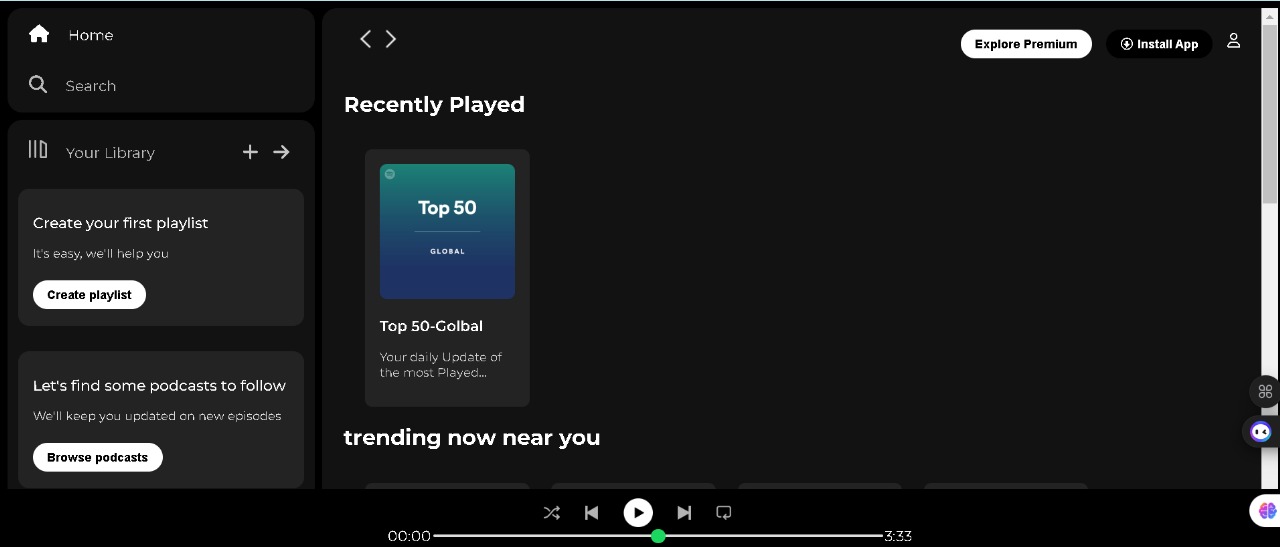
Spotify-style player
A UI-focused clone exercise that recreates navigation, content rails, and the dark “player” aesthetic of a modern music app — prioritizing hierarchy, density, and motion over backend integration.
Context & goals
Streaming apps are deceptively difficult: they pack navigation, marketing rails, personalized shelves, and a persistent player into one viewport. I used this clone to practice translating a dense reference UI into maintainable HTML/CSS, and to prove I can control contrast, scroll regions, and hover affordances without leaning on a component library.
Success meant the shell should feel “alive” at a glance — correct dark surfaces, subtle borders, and typography that stays legible when backgrounds are nearly black.
Layout strategy
The shell splits into a fixed sidebar, a scrollable main column, and a bottom player strip. I used flexbox for the macro layout and CSS grid inside rails so album art tiles stay aligned when titles wrap to two lines. Breakpoints collapse the sidebar into a narrower strip and tighten gutters so the same markup works on smaller laptops.
Color is tokenized through CSS variables for background tiers, border hairlines, and muted text. That made it straightforward to tweak contrast as I compared against the reference screenshots.
What I shipped
- Dark theme shell: sidebar, main discovery surface, and persistent player bar
- Card-based rails with consistent image ratios and hover elevation
- Responsive behavior for mid-width screens where horizontal space is limited
- Light JavaScript for tab-style navigation cues and small interactive polish
- Static deployment on GitHub Pages for instant sharing in applications and interviews
Tech & constraints
HTML, CSS, and vanilla JavaScript. No build step — useful for demonstrating that I can ship readable markup and organized stylesheets that another developer could pick up quickly.
Results & lessons
The exercise sharpened my eye for micro-spacing and typographic rhythm in dark UIs. The hardest part was resisting “magic numbers” for padding; locking to a spacing scale kept the rails visually aligned when content length varied.
Next iteration would hook real audio APIs or at least a playlist JSON model, and add keyboard shortcuts for play/pause to mirror production accessibility expectations.